Statistics, visualized

February 11, 2009

I wrote a recent post about a visualization of the rate at which Wal-Mart and Target stores have opened over the last several years.

Well, this is on a similar theme — bringing statistical information to life, visually.  Seattle photographer/artist Chris Jordan has an amazing series of works called “Running the Numbers: An American Self-Portrait.”  In it, he brings to life America’s consumption habits (among other things) in a way that really stops you cold.

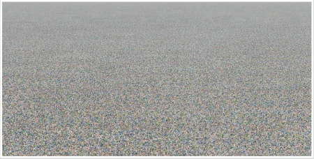
This shot from the exhibition shows two million plastic beverage bottles — the amount used in the united states every five minutes.
2million-plastic-bottles1

Can’t see the bottles?  Seriously, check out the images — including close-ups — at Chris Jordan’s site.


Pondering Wal-Mart (and Target, for that matter)

February 10, 2009

I have spent an inordinate amount of time over the last month pondering phenomenon of Wal-Mart, its growth and its enormous reach.  I’m not going to say why. Sometimes things in advertising must remain confidential because it is SO DARNED IMPORTANT.

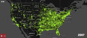
Nevertheless, as I toiled with my colleague from Los Angeles, Jefferson Burruss, he showed me something really interesting about Wal-Mart.  Check this out, it’s by the folks at FlowingData and maps the growth of Wal-Mart over the years.

walmart-mapNow, just for shits and giggles, let’s take a look at Target and how it grew.  Take a look here.  I just think it’s interesting how these companies have taken off. The rate of growth is different, for sure, but so is the geography.  Probably explains a lot about why these  brands are perceived differently in different parts of the country — and by different demographics.

Oh, there are a lot of things we could talk about with these tow companies, but I’m going to skip that and just marvel at the growth stories illustrated here.